|
a free and open toolkit for 2d/3d seismic data analysis |
|
kogeo seismic toolkit |


|
Contact:
|
|
Phone (home): +49 - 40 - 2780 7890 Phone (office): +49 - 40 - 42838 5234 Fax: +49 - 40 - 42838 7081 E-Mail: konerding@geowiss.uni-hamburg.de |
|
Features |
|
Many of kogeo‘s functions can be accessed via the four toolbars: · The main toolbar:
· The data toolbar:
· The project toolbar:
· The 3d-data toolbar:
The first thing to keep in mind is, that in general toolbar buttons and menu items are only enabled when a window corresponding to the function is having the input focus and suitable data is active - so don’t panic if you see most of the things in grey at the beginning. Some buttons work with all the different windows (views) of a kogeo session, some others only with a part of them. Below you can find some explanation of things around these toolbars.
Main toolbar: The main toolbar offers the usual functions to open and save kogeo sessions. In a session (stored on disk as a .kgs file), all relevant information about opened windows, data etc. is saved and restored when a session is opened.
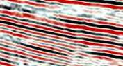
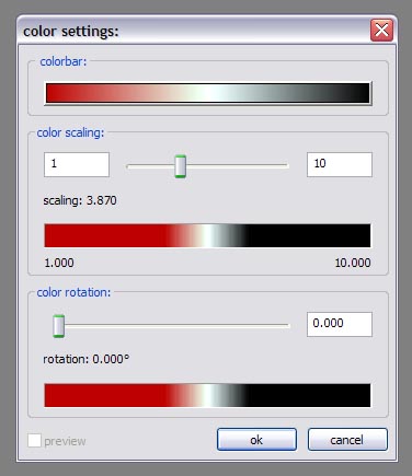
Data toolbar (general features): The main component of a kogeo session is the so-called data view; this is the empty window you‘ll see after starting kogeo. Every session might contain only one data view, this is the place where seismic data is displayed in the common 2d form; use the ‘Data>Import SEG-Y/SU data’, ‘Data>Import bitmap data’, or ‘Data>Import 3d SEG-Y/SU data’ menu items, to get data into kogeo (read the Data import/export section to find out more about this). You can manipulate the display color settings by clicking on the ’Setup colors’ button or use the F1-F4 keys to change the color scaling according to the color setup. The active colorbar is displayed in data toolbar, right to you can find what this colorbar is actually used for (line amplitudes when a data view is active, slice amplitudes or horizon z-values when a map view is active). The ‘Setup colors’ button will bring up the ‘color settings’ dialog:
Here, you can adjust the color scaling in a given range (upper slider), the colorbar might also be rotated (lower slider). When the preview option on the bottom of the dialog window is activated, changes will be immediately applied to the corresponding view. If you press the colorbar button on top of the dialog window, the colorbar editor will appear:
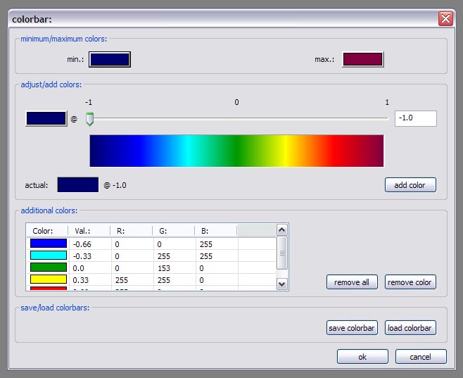
A colorbar contains two fixed entries: a minimum and a maximum color, they’re specified in the uppermost section of the dialog window. In the middle section additional color nodes can be added to the colorbar. These will appear on the list in the ‘additional colors’ section, from where they can be deleted using the ‘remove’ and ‘remove all’ buttons. All changes to the colorbar will be immediately visible in the control field below the slider. Colorbars can be saved and opened using the corresponding buttons at the bottom of the dialog window. You can find a selection of pre-defined colorbar files in the download section. The spatial scaling of the displayed data is done using the different zoom buttons, or by entering values directly in the ‘zoom x/y’ fields (and hitting the Tab key afterwards). There’s a special way of displaying seismic attributes in a data view via the ‘Immediate seismic attribute display’ button and it’s dependant, the ‘Set immediate attribute display area’ button. Using them you can display seismic attributes directly, without physically transforming the data stored in memory (like it is done e.g. in data editing). This might be useful as a preview. The buttons on the right (‘Tickmark/ruler options’, ‘Display options’ and ‘Create layout’) are universal tools that work with (almost) all windows in kogeo; just try them, I think the stuff is self-explaining.
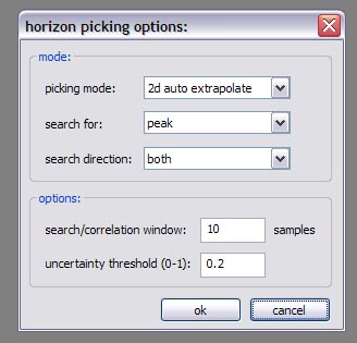
Project toolbar (map view): When a project database is activated by using the ‘Project>Open project database’ menu item, a second window will appear: the map view. On the map view all seismic lines that belong to the active dataset will be displayed (in a 2d dataset; 3d datasets might contain only 1 seismic ‘line’). You can select seismic lines by clicking on them with the mouse and compose arbitrary lines by clicking on others holding the shift key down. Selected lines can be displayed in the data view by clicking the ‘Display selected data’ button of the project toolbar. The dataset and line management for the active project can be accessed from the ‘Project’ menu. Since all data must have unprojected navigation when you add it to a project, use the ‘Change map projection’ button to adjust the map view display. I suggest to do so, put the map view and the (empty) data view in convenient positions and save the session then. When you open it later, all settings will be restored. Project data can also be displayed in 3d using the four buttons on the right of the project toolbar. If you want to edit material parameters of a line or a slice displayed in 3d, activate the corresponding data or map view before pressing the ‘3d objects—edit material parameters’ button. Generally everything you can see on the different 2d views of your session will be displayed in 3d as well. The button ‘Toggle horizons’ activates/deactivates the horizon display; you can add horizons to a project database using the ‘Project>Manage horizons’ menu item. Horizons are digitized with the mouse: Nodes are added by left clicking, use the Control key to delete nodes or split up digitized Polylines. Active line segments can also be deleted as a whole using the ‘delete’ key. A right click updates the project database and fills up the horizon values trace by trace (in manual picking mode). There is also some autopicking functionality (by now 2d only, I’ll try to add 3d functionality as soon as possible), you can change between the picking modes using the F9-F12 keys or within the ‘horizon picking options’ dialog, which is opened with the corresponding button (available only, if horizons are activated):
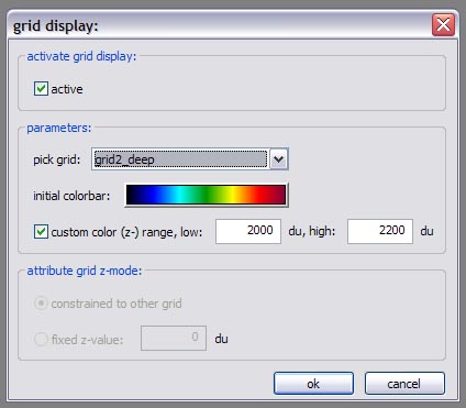
If the picking mode is set to ‘2d auto fill’ the picking will work like in ‘manual’ mode, but during a database update, kogeo will attempt to follow horizons instead of linearly interpolating the picks for individual traces. In ‘2d auto extrapolate’ mode the horizon will be followed automatically from one starting point up or down the profile (depending on the ‘search direction’ setting). The extrapolation will stop if the certainty of a pick falls below the given ‘uncertainty threshold’. The autopicking process itself is a mixture between the search for a given feature (peak, trough, zero crossing) and a cross-correlation between two traces; the window length for the computation can be specified in the ‘search/correlation window’ field. Grids within a project can be displayed via the ‘Grid display’ button. It will bring up the ’grid display’ dialog window:
After the grid display is activated (checkbox ‘active’), you can choose a grid to display and the colorbar you want to be used. If the color range should be any other than from the min. to max. values of the grid activate the custom z-range function and specify a range of your choice. If the selected grid is an attribute grid choose display mode in the lower part of the dialog window. Attribute grids can be displayed at a constant z-value (depth) or aligned to another grid that contains the depth values. In the latter case, both grids must have the same dimensions/extent; you will be prompted to choose the grid to align the attribute grid to after you pressed ‘ok’. Grids are displayed in the project’s map and 3d views. A rather strange function is accessed by clicking the ‘Create new linked dataview’ button, which is only enabled if the main data view of a session is active. With this function a new data view is created (that represents a new session, in a strict sense), which is linked to the session it was created from. Like this you can view more than one line at a time, e.g. to display them in the 3d view. When a linked data view is enabled, most of the general functionality will not be active.
3d data toolbar The 3d data toolbar is only needed when you work with 3d data. It allows you to change between inline and crossline display; you can enter the lines to display directly in the toolbar or use the arrow buttons to increase or decrease line numbers. The time and horizon slice buttons on the right part of the toolbar toggle the display of slices in the map view in a similar fashion like the inline/crossline display, the ‘shift’ field sets a time offset for horizon slices. |
Read more about... |
|
...kogeo‘s user interface: |
|
Home |
|
About kogeo |
|
Features |
|
Download |
|
Building instructions |
|
Guestbook |
|
Home |
|
About kogeo |
|
Features |
|
Download |
|
Building instructions |
|
Guestbook |
|
You‘re visitor no.: |